Where AI is missing in design
I was asked a number of months ago in a meeting about where I thought nobody is using AI in creative tools. This made my mind jump immediately to what I see as the biggest misstep with this latest wave of AI. That is replacing the fun bit (producing a creative thing) with the bullshit of typing prompts. The creative act is looked at as an engineering problem, something to be managed and processed away. Which is wrong.
We’ve been promised since time began that machines will do the drudgery work for us. In the creative tools realm this means things that have to date largely been done manually, and for extensive amounts of time, like masking bits of images in photo editing or rotoscoping in film post-production. This sort of work is repetitive and often painful. AI tools are now getting pretty good at doing this sort of thing though. Yay, the machines are doing what was promised.
But now with this prompt-to-image thing, which I’m partial to calling a fad, the machines are going to do all of it, meaning the fun and/or rewarding part where you create the image. Sure rewarding implies there is a struggle, which there is, but there is a payoff. You do some things and you create the image. The key one would image would be to do less of the painstaking things and not just do all of it.
So there I was on that call and I thought of the thing that drives me, and anyone with any sort of graphic design background insane, typography. Now, I’m not talking typography itself, the design with type, placing words and letters and elements in interesting ways automatically. No, that is too easy and unnecessary, and all the reason one even goes into any sort of graphic design as a practice. I’m talking about doing all the in-between, manual bits to make the happen.
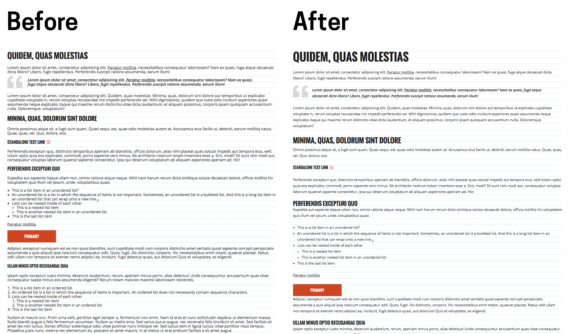
Once quite a while ago I asked a junior coworker about the vertical rhythm of an interface we were working on. He didn’t understand. Vertical rhythm is the thing that once you see it, you can’t un-see it. It’s everywhere. It’s the little thing that when not done, or not done well, will just make something read or look a bit off.

See how no matter the size, the bottoms of the type all line up?

Most importantly, vertical rhythm and fitting type and the layers upon layers of grids and visual lines that designers have to still calculate themselves, is still done manually.
In architecture, they’ve been doing this for ages with procedural architectural software that lets you put in the parameters and then it does all the adjusting to the fit.

Somehow this is easier for a computer to do than letters. It seems like a quite easy thing to do (famous last words), and something designers need to be doing rather than generating stock imagery of slightly distorted, airbrushed people-like things.
